

Covid Dashboard Project
Steve’s Covid DashBoard
Description
Our world has forever been changed by the Covid-19 pandemic. As of August 2021, we are still seeing the effects and there is no end in sight due to variants running rampant. I wanted to use my data wrangling skills to evaluate the current global Covid-19 status. For this project, I used the Coronavirus (Covid-19) Deaths dataset from Our World in Data. From there I imported the data into SQL server to perform simple transformation through queries. Finally, I used Tableau to create the tables that are shown in the dashboard shown below. Here (repo) is a link to the GitHub repository that contains all the SQL queries and all of the files needed to create the Tableau dashboard.
Getting Started
After downloading the data, I used Excel to create the two tables that will be used in SQL. Later on, I will join the two tables in SQL to create a unique query.
Covid Deaths Table :
The first table is going to include all information regarding the deaths. There is only one simple modification needed to make this data SQL “ready.” I want to separate the vaccination data from the data pertaining to cases and deaths. I also want to move the AS(population) column further up in the workbook as it contains population data. To achieve this I selected the AS column and then used the Ctrl + X feature to cut the entire column and its contents. To place the population column where I needed it, I then right-clicked on column E (total cases) and selected “Insert Cut Cells.” Now the population column is securely nestled next to the date column. Finally, to separate the vaccination data, I highlighted the AA column and clicked Ctrl + Shift + Right Arrow. This highlights all columns after this point and from there I deleted everything that was highlighted, leaving only the Covid death-related information. I saved this file as CovidDeaths.csv and stored it for later use.
Covid Vaccinations Table:
Now I’m trying to achieve the inverse of what was accomplished with the creation of the Covid Deaths table. This is very simple to execute. Using the same excel document I use Ctrl + Z which brings back the previously deleted columns. I simply deleted all of the contents in columns E-Z. I then saved the file as CovidVac.csv. Note: These tables are located in the above-mentioned GitHub repository so that you can create the queries and views mentioned later in this document.
SQL
Importing tables
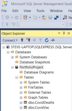
With the two tables created the next step is to import them into SQL Server. If you need help setting up SQL Server please click here for instructions. The first thing that I did is create a database and named it PortfolioProject. I then imported my recently created tables by right-clicking on the database, selecting “Tasks” and “Import.” This opens the Import and Export Wizard. The data source that you want to choose is Microsoft Excel. The destination has to be SQL Server Native Client 11. When done correctly, the database should look like this:
Running Queries
After loading the tables we’re ready to query! This is a very large and useful dataset. There’s enough information here to run an infinite amount of queries. I ran queries to find the following pieces of information: Total Cases vs Total Deaths, Total Cases vs Population, Countries with Highest Infection Rate compared to Population and Countries with Highest Death Count per population.
I joined the two tables (Covid Deaths and Covid Vaccinations). I created a column that calculates the rolling number of people that have been vaccinated. In order to use that column in data calculation, I created a CTE. Finally, I created and saved a view that can be used for later visualizations.
Workaround
In a standard work environment, I use the full-paid version of Tableau (Thanks to the great company that I work for). I am using the public (free) version of Tableau and there are some limitations that have modified the way my data will be sent to Tableau. I’d usually be importing the views/tables directly by connecting Tableau to SQL Server. That option isn’t available in the public version, therefore, I am going to save the queries to excel documents, save the documents and then import the documents into Tableau. You’ll notice in the query file that there is a section entitled “Creating Queries for Tableau Dashboard.” You can see the end result of this process in the “tableau-table-files” folder in the GitHub directory.
Tableau
After importing the excel files into Tableau, I created four tables to use for the Dashboard.
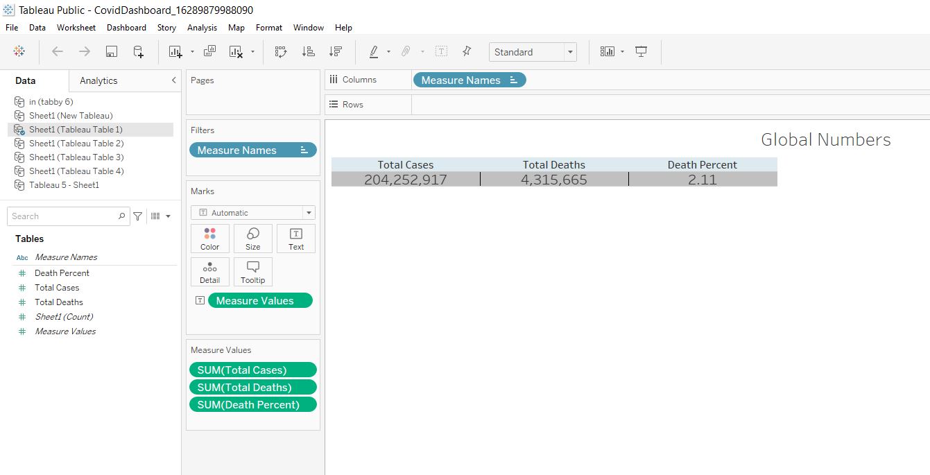
Global Numbers Table
The first table is a simple chart that shows global pandemic numbers. It utilizes the “Total Cases”, “Total Deaths” columns from the “Tableau Table 1” Excel file.
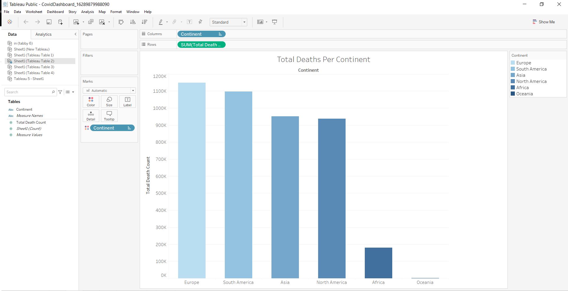
Total Deaths Per Continent Table
The second table is a bar chart that shows the total amount of deaths on each continent. It utilizes the “Total Death” and “Continent” (renamed from Location) columns from the “Tableau Table 2” Excel file.
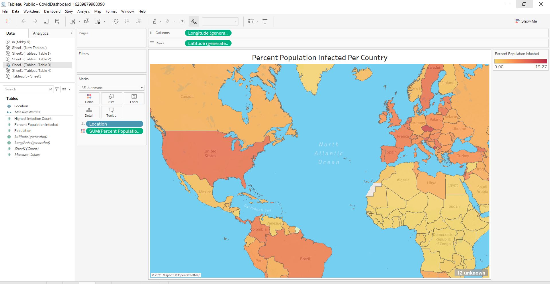
Percent Infected Map
The third visualization is an interactive color-coded map that shows the total percentage of each country that has been infected with Covid. This utilizes the “Location” and “Percent” population columns from the “Tableau Table 3” Excel file. In order to generate the latitude and longitude values right click on the “Location” variable, navigate to “Geographic Role” and select “Country/Region.” This allows the map to be made available.
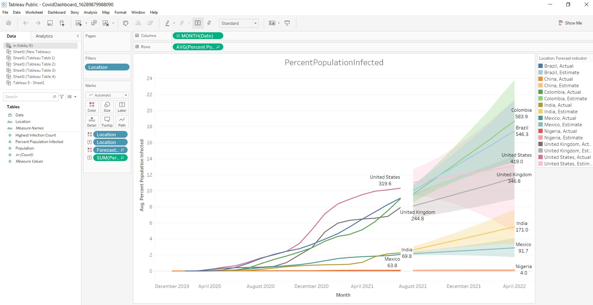
Percent Population Infected Line Chart
The final visualization is a line chart that shows a rolling percentage of selected countries’ infection rates. This utilizes the “Date” and “Percent Population Infected” columns from the “Tableau Table 4” Excel file. I also added a forecast value that predicts the percentage of infections for each country from now until April 2022.
Final Product
Below is the dashboard that was made. This can also be seen here on my Tableau profile. This was a fun project and I look forward to creating more exciting posts like this!